This entire article is based on unbounce.com's article on the seven principles and Sam Kusinitz’s blog on HubSpot.
We have heard about user-oriented design, object-oriented design, people-oriented design, service-oriented design, and more. These methodologies or approaches are each addressed at a specific topic or point, making them different from each other. The same goes for conversion-oriented design, which focuses exclusively on marketing.
What is conversion-oriented design?
It is a framework or design approach that seeks high conversion ratios to achieve significant sales in marketing campaigns, creating a good experience for the landing pages of such campaigns.
A successful landing page achieves high conversion rates thanks to its good experience design and visual design since it makes the user do the desired action easily, without distractions. All landing pages lead to a specific action: a purchase, registering for an event or activity, downloading a file, etc. When we have more than one action on our landing page, we are blurring the user’s focus on the desired action since we give them more than one option. Thus, we are worsening or deteriorating both the experience and the conversion.
The definition of conversion-oriented design does not stop there; seven principles help make our design more practical and functional. Their author is Oli Gardner, co-founder of a marketing platform dedicated to the design of web templates for landing pages. Its name is Unbounce.
The seven principles of conversion-oriented design
It is a design framework or approach that seeks high conversion ratios to achieve significant sales in marketing campaigns, creating a good experience for the landing pages of such campaigns.
1. Focusing on the experience
For a landing page to direct the user to the desired action (interact with the CTA), a focus must be created on the experience that leads to that point. As mentioned at the beginning of this article, many options (all different from each other) on a page distract the user from the action they are expected to take, and this lousy practice can even cause losses because no marketing campaign is free. There is always an investment, and a poor landing design ensures a bad ROI (Return on Investment). We must keep in mind that the attention ratio should always be 1:1, that is, an action the user can do versus the action they should do. When we have more than one action available on our landing page, the chances of having an excellent conversion are meager. Remember that landing pages have only one objective, achieved through an action. Pages with many different actions are homepages whose purpose is to be explored because they offer diverse options to the user depending on the solutions they can sell.
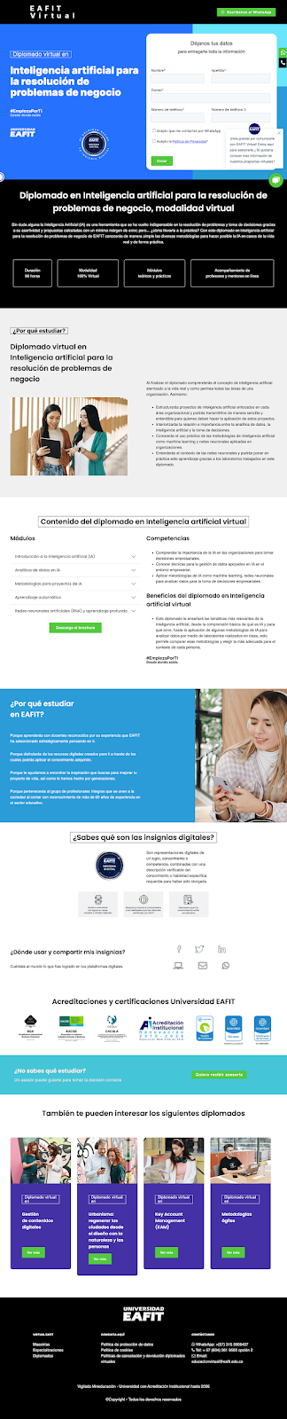
The above is an example of a page with more than one action. If it is a homepage, it will fulfill its function due to the variety of activities that there may be. Still, if it is a landing page, it will not have a fixed focus due to the multiple options, resulting in a negative conversion rate.
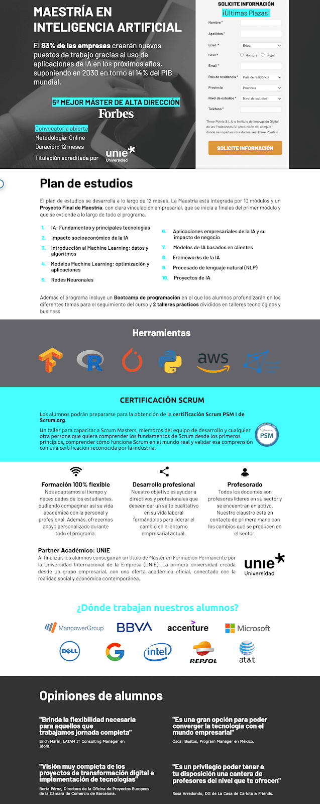
This is an example of a landing page with an attention ratio of 1:1 since there is only one available action compared to one desired step. With this, a high conversion rate (CRO) can be guaranteed, which is the objective sought with the CTA of a landing page.
2. Hierarchy and context
A visually pleasing page with no hierarchy in its information is useless because it would disorient the user. The most important thing when creating a landing page is to first think about the textual content that will be shown (copywriting) and then proceed to the design since the latter adapts to the content, not the other way around. Visual design and its textual content must work together, not separately, since both work toward the same objective.
With the hierarchy, we can even define a flow that directs the user’s view, like an imaginary line they would follow unconsciously since the content is organized to take them in a single direction. Achieving this guarantees a greater chance that the user will perform the desired action on our landing page.
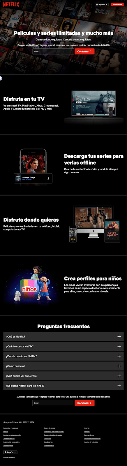
|
Netflix is an example that, while having two CTAs, both are the same (they are not different options) and can be reached from the moment you enter the page or at the end if the user wants to review all the content of the page (FAQs reinforce the content and do not distract the user from the desired action; they clear up their doubts). |
3. Consistency and clarity
The way to reach a landing page in a marketing campaign is through advertising or emailing, the Google Display network (a set of millions of websites where our Google ads can appear), or social media (the famous advertising posts in the feeds and stories of Facebook, Instagram, etc.). This is where consistency comes into play. Both the content of the ad and landing page and the branding must be as consistent as possible, that is, the same brand colors, similar texts, the same images, etc. (note that in ads, the content will always be much shorter compared to the landing page because they work as a hook that takes the user to the website) so that the user is always seeing the same product and not something different.
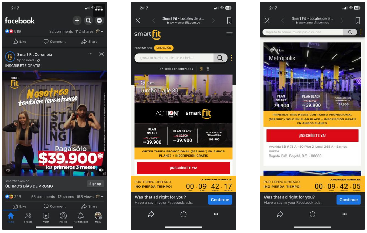
The above is an example of a Facebook ad where several advertisement elements are still preserved on the landing page. Although there are several CTAs on the gym page, they all meet the same registration objective, except each is adapted to a different location for the user to register wherever is most convenient for them.
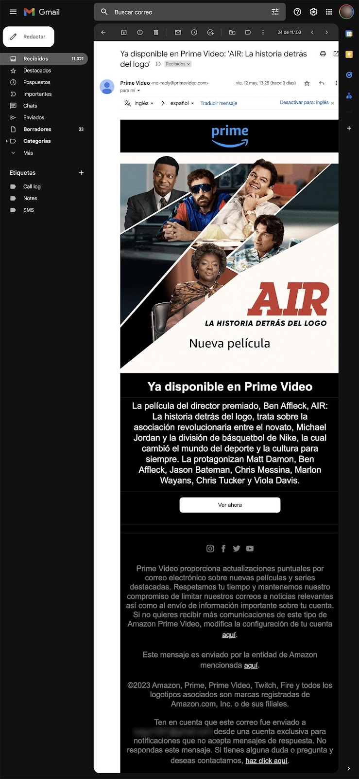
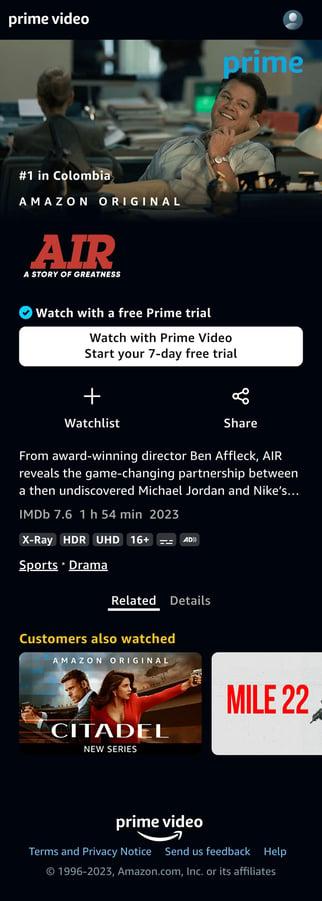
For this example of email marketing, the message ad in the email has the same context and consistency as the landing page where the user is directed. This Amazon Prime advertising keeps the same colors, texts, primary images, and the CTA button on the landing page. Although there are more movie options for the user, they are in the background, and the priority is always on the same content shown in the email message.
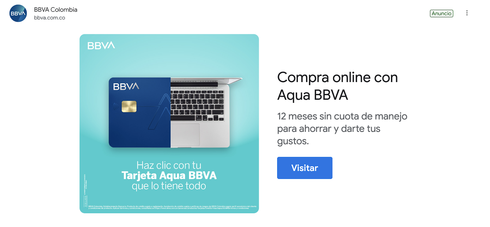
This is another example of email marketing that is not applied correctly. They mention a specific card in the ad, but when redirected to the landing page after clicking on it, we see that the information is scattered. They ask for personal data to submit a “personalized offer” to the user when another product has already been offered. In conclusion, consistency is not maintained across areas.
4. Consistent content
The images, videos, or illustrations chosen for our landing page should not be randomly selected since these three options must reinforce what our page wants to communicate. If they do not achieve that objective, it will likely not work well on the page. Accordingly, we must be emphatic that if we place several of the content options mentioned, the most important is the one that goes on the hero (a large banner at the top of a web page). Why? Well, it is the first thing the user sees when visiting our site, and if the hero content achieves empathy with the user, the chances of success are much higher. Something remains to be said: the more original (of our authorship) our content is, the greater trust and empathy the site can build. Seeing actual images or video interacting with the product develops more interest than using image bank content (the chances that the bank images on our site are the same on other pages are high, reducing credibility).
|
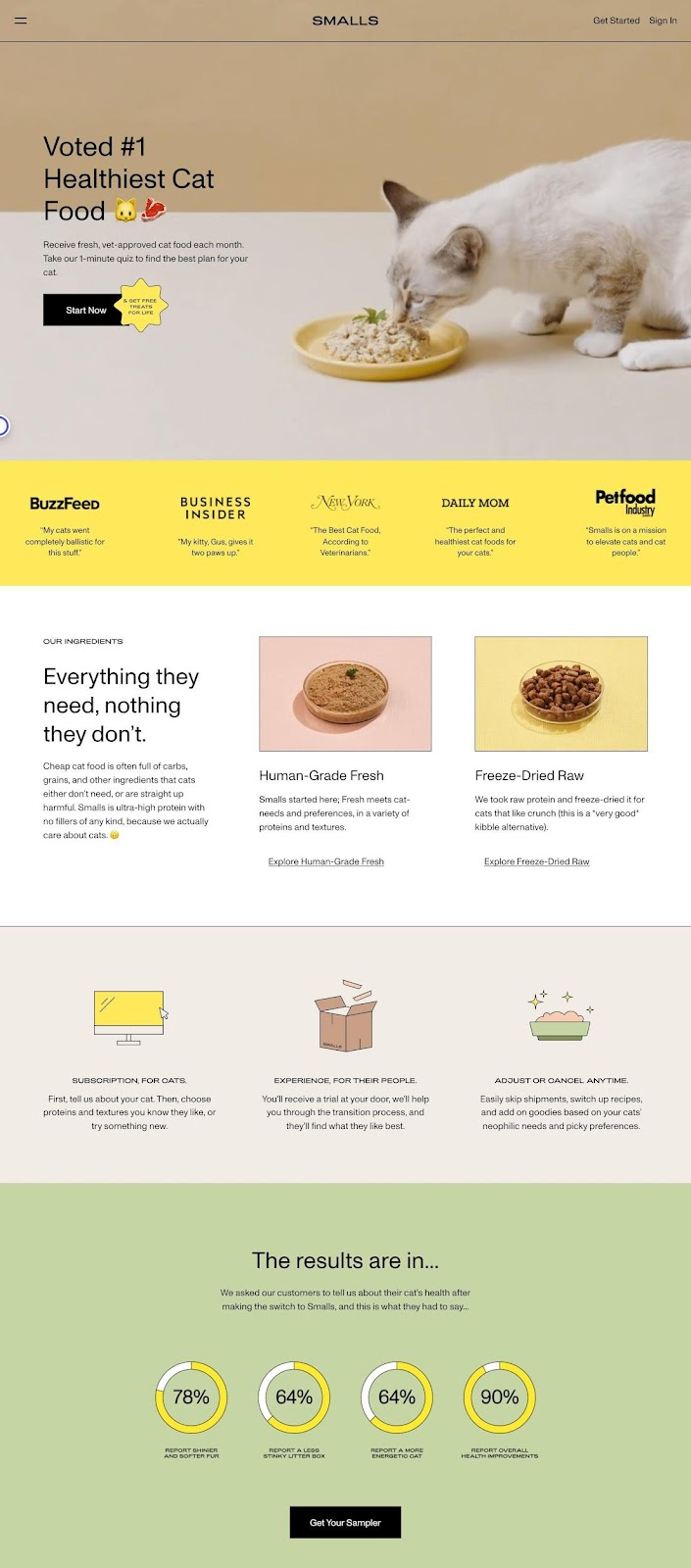
This site is smalls.com, which sells cat food. It is not a landing page per se. Still, it is an excellent example of how a hero can attract the user’s attention by showing a looped video of a cat eating the product they sell, in addition to the rest of the site, which also has content about the company and comments from buyers. |
5. Capturing attention
It is like the first principle but about getting the user to focus on specific points this time. We must remember that with a good balance, we can attract the necessary attention of the user, but how is it balanced? Look for contrast in colors and texts, giving enough space around the contents to not distract the user. One of the elements that should be highlighted on the page is the CTA button since the conversion rate on the landing page does not increase due to exploration but due to the clicks on our CTA; therefore, this button must be the protagonist around which the story told on our page revolves. Using the 60-30-10 rule of color in an interface (60% primary or dominant color, 30% secondary color, and 10% accent color), we can attain a pleasant experience since the balanced contrast would attract the user’s attention to where we want it to go.
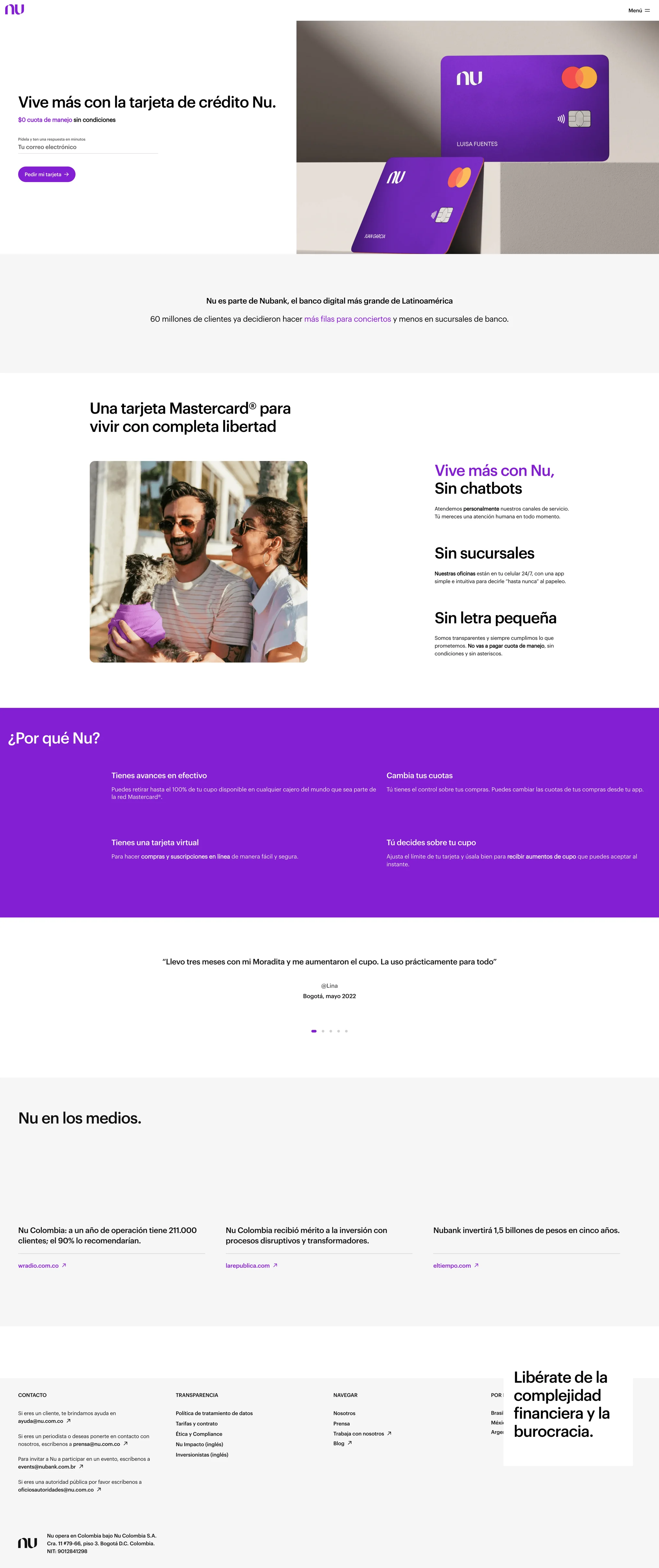
This Nubank landing page is an excellent example of a balanced use of colors and shades, giving enough space for reading without distracting the user from the desired action on the banner. The rest of the page only shows information to give the user confidence and purchase security.
6. Showing reliability
On the Internet, most users distrust many pages because they have content that does not convey much credibility. They can be scams, clickbait (a way of attracting users by manipulating them with an advertisement that is very appealing but whose content is not satisfying or inconsistent with what is advertised), or malicious sites that only seek to contaminate your device. Our landing page must have actual content, specifically testimonials, to avoid user distrust. What do we mean by testimonials? The comments of users who have already used the product we are selling and had a good experience. Not only written testimonials but also ratings help. E-commerce is the king of testimonials; pages like Airbnb have many examples of how to convey credibility through accurate comments (and verifiable, that is, they have the full and real name of the user who comments along with an actual photo, and if he used it for the company where he works, then his position must be mentioned).
Another way to convey credibility is by showing the brands that have used it and, if recognized, much better. Let’s try to use a single shade (monochrome) to not distract the user from exploring the page.
The consumer brands section of the usebubble.com program builds trust, and using dark gray does not distract the user from the rest of the page.
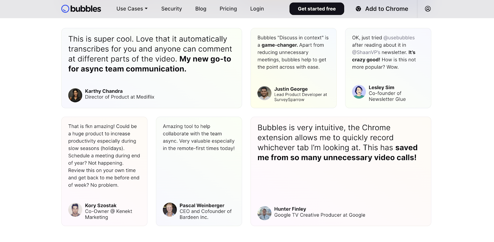
Its testimonials section gains more credibility for the product by having more than one comment.

Airbnb is an excellent example of building trust or credibility in what it shows, even if they are not their products but users offering their services within Airbnb. Airbnb’s positioning, plus the comments and ratings of users within the accommodations offered, are a ten.
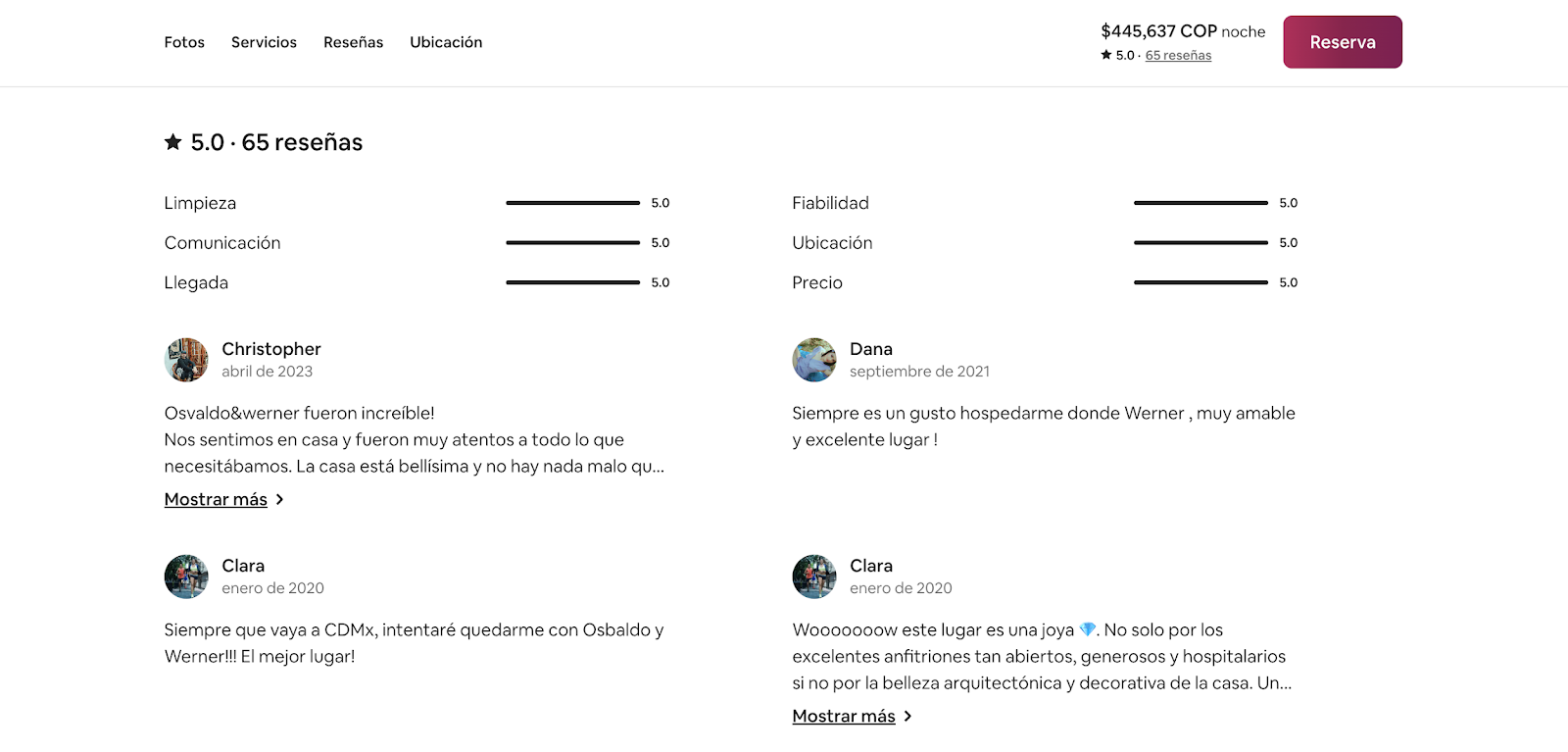
In the case of Airbnb, most testimonials will be from ordinary people, but they are real users who give an opinion of the product, lending credibility to the service.
7. Reducing friction
This seventh principle makes life easy for the user by working from several fronts: compact or better-distributed elements, page loading speed, responsive design, and accessibility. When talking about compacting pieces, we mean not making tasks tedious for the user; for example, forms having many fields can scare the user away and indirectly invite them to abandon the site. To solve this case, the most suitable thing is to remove the fields that may be extra, leaving only the questions necessary to obtain information from the user.
The second front has two issues: loading speed and responsive design. These two go hand in hand because the most significant web traffic of users comes from mobile devices. Therefore, our page must adapt to those dimensions and resolutions, showing more summarized information and fewer multimedia files. This helps with page loading; the heavier it is due to the poor optimization of multimedia elements (images, videos, illustrations, etc.), the worse the experience will be from mobile devices, and page abandonment will be more likely than conversions per click. Thus, we must optimize all content for the responsive versions of our page.
Last but not least is accessibility. Every design must be “universalized” and accessible to everyone, and this applies to both the desktop and mobile versions of pages. The World Wide Web Consortium (W3C) established several accessibility criteria (WCAG 2.0) that must govern all websites. These are not final because they are constantly updated as needed. Those criteria can be found [here].
To summarize, these principles help create landing pages with a very high probability of success, but at the same time, they are not mechanical and definitive steps to follow, much less a magic formula. Our environment is volatile and not very predictable, and the needs of all users are not always the same. Everything relies upon trial and error; experience plus these principles equals excellent results.
Don't Settle for Average Landing Pages - Achieve Sky-High Conversions with Pragma

Share this

What Is Omnichannel and How to Take It to the Next Level

Omnichannel Strategy: What iI It and How to Take It Next Level
The Impact of Technology on the User Experience